
ggplot2 + plotly: Simply animate your ggplot2 graphs by utilizing one function
Interactive Graphs in R

I’m going to walk you through how to make your charts more interactive, with the ability to display more contextual information. The R packages we’ll be utilizing are ggplot2 and plotly. We’ll specifically be using the ggplotly() function within plotly.
So you can easily follow along, we’ll be utilizing the iris data set within R. At the end I will show you how we can translate this information and create a more real-world example.
To view the markdown so you can copy/paste all of the code and interact with the graphs, head over here!
Let’s learn how to use ggplotly()
First let’s load the packages and take a quick look at the data set we’ll be utilizing. I chose this data set since it’s easy to work with and has easy to understand groupings.

Create our base ggplot2 scatterplot
For these examples we won’t bother with adjusting our axis or title labels so that the code is easier to interpret and there’s less “filler”.


Call ggplotly()


You’ll notice in the above code chunk we had to assign our ggplot to a variable. This makes it significantly easier to wrap ggplotly() around and improves the readability of your code. Just this step alone, made it easier to distinguish the value of each point in our graph; all we have to do is hover over the point.
What if we want to rename the text that displays when hovering over a data point?
In the next 3 sections we’ll cover:
Editing the text
Inserting additional values into the hover text
Changing the background colour of the hover box
Adjusting the hover text
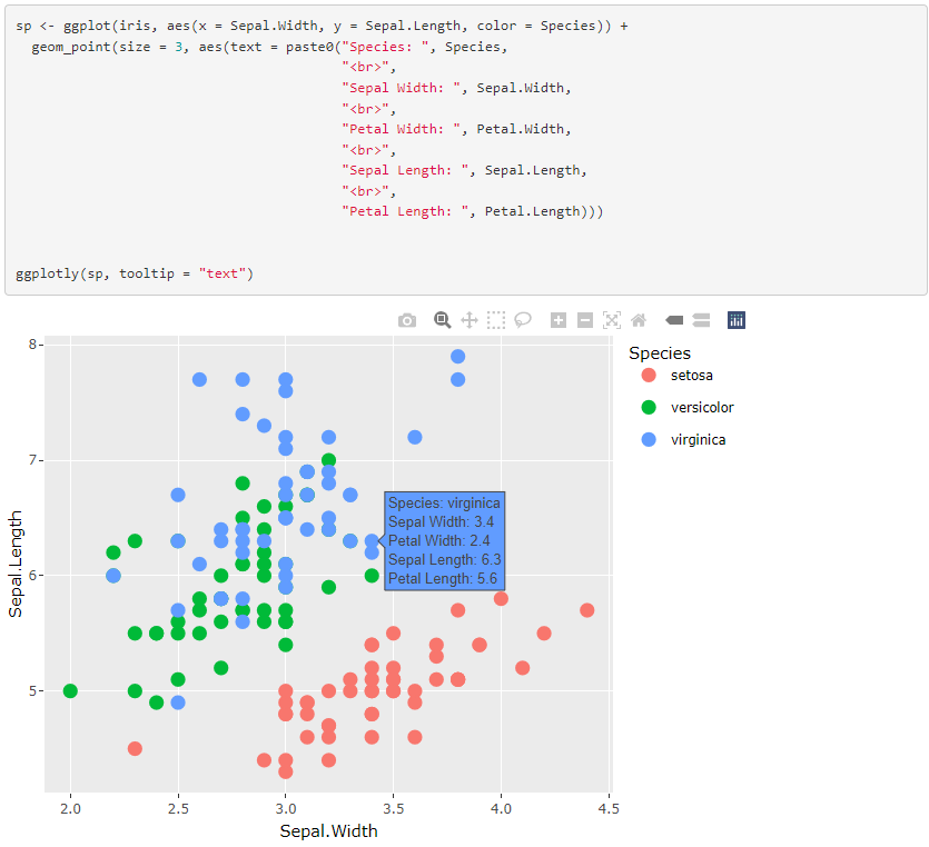
In the previous graph you may have noticed the variable names default to the data frame column names. This may not always be preferred. The order of these variables may also not makes sense from a readability perspective.
For this example we’ll move Species to the top, rename Sepal.Width to Width, and rename Sepal.Length to Length.
Let’s take a look at the code chunk and corresponding graph first!

Adjusting the text required 2 things:
Creating a text parameter within the geom_point() aesthetic
Setting the name of the parameter we created to the tooltip parameter in ggplotly()
All that is required to adjust the text is to format the text you would like displayed. We can use paste0() to help us create a string. You’ll notice the <br> tags in between each line. This makes each variable we’d like to display appear on a new line. You can even add extra spacing if you desire!
The text renders as html, so you can easily customize how you would like your text displayed. For example if we wanted to bold the labels we could do the following:

Adding variables to the hover text
Other column values that don’t appear on the graph can easily be added to your text field. This can often add some extra contextual information. As you can see below, I’ve added each column value to the text so you can see the full species’ information while hovering over the data point.
Change hover text background
When you have coloured groups, the hover text background will typically default to the respective data point’s colour. In some cases it will default to a dark grey. If you would like this background to be a single colour, here’s how you do that! This step needs to be done when calling ggplotly().

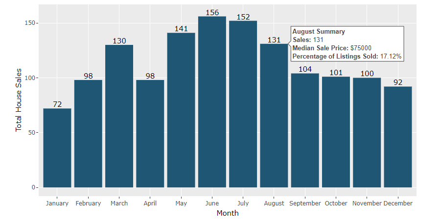
House Sales Example
This graph will be using some data from the txhousing data set within the ggplot2 package. We’ll be looking at monthly house sales for the city of Abilene in the year 2000.


That’s it!
Animating your ggplot2 graphs with plotly isn’t overly complex and doesn’t require you to learn an entire package. There are some nuances as you’ll noticed with how I positioned the geom_text() in the house sales graph. I typically wrap the majority of my ggplot2 graphs in ggplotly() since improve the user experience. Not only can they glance at the graph to get basic information, but simply hovering over a data point their interested in will provide them with additional information, without navigating away from the graph.
To view the markdown so you can copy/paste all of the code above and interact with the graphs, head over here!